Blinkist
A Fresh Look for Bite-Sized Learning
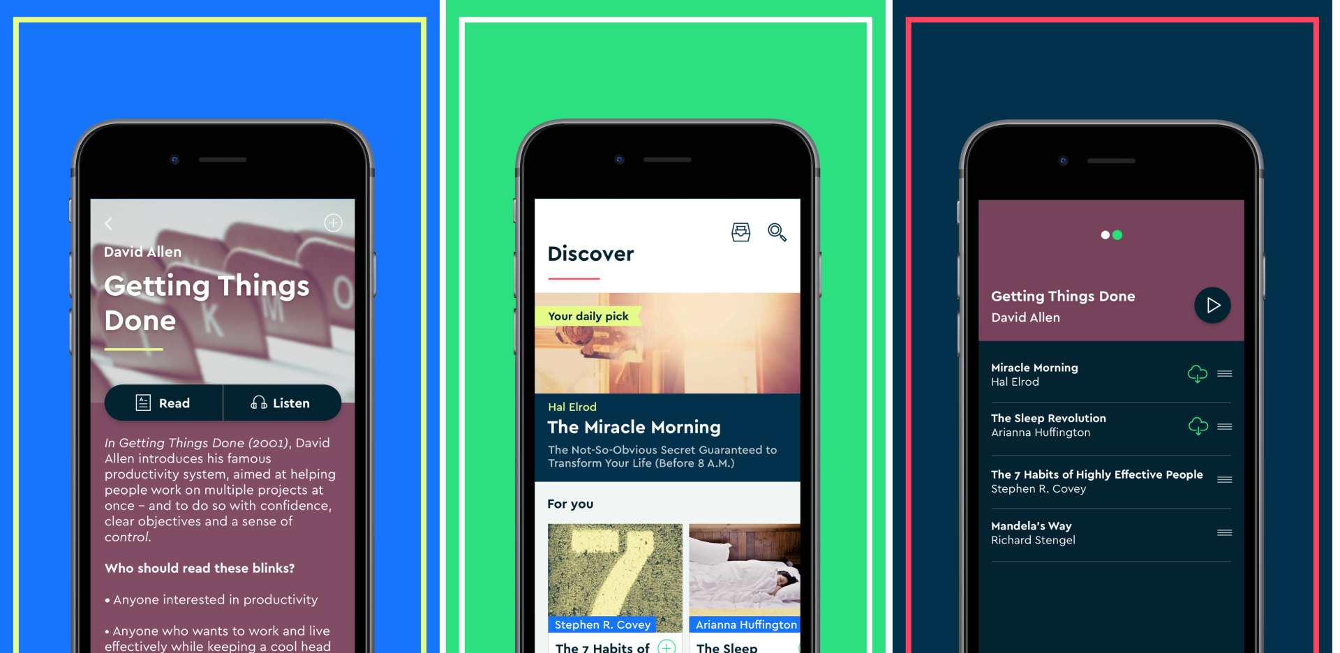
By 2016, Blinkist had evolved from its scrappy startup origins. We were gaining traction as a player in the education space, but our brand identity hadn’t kept pace. It lacked finesse, personality, and strategic clarity. We needed a visual identity that reflected who we were becoming, not where we’d been.
The challenge
The goal was to lead a comprehensive rebrand that signalled our strength as a product, company and brand — overhauling the visual identity across mobile apps, web product, and all marketing materials, with a small, three-person design team.
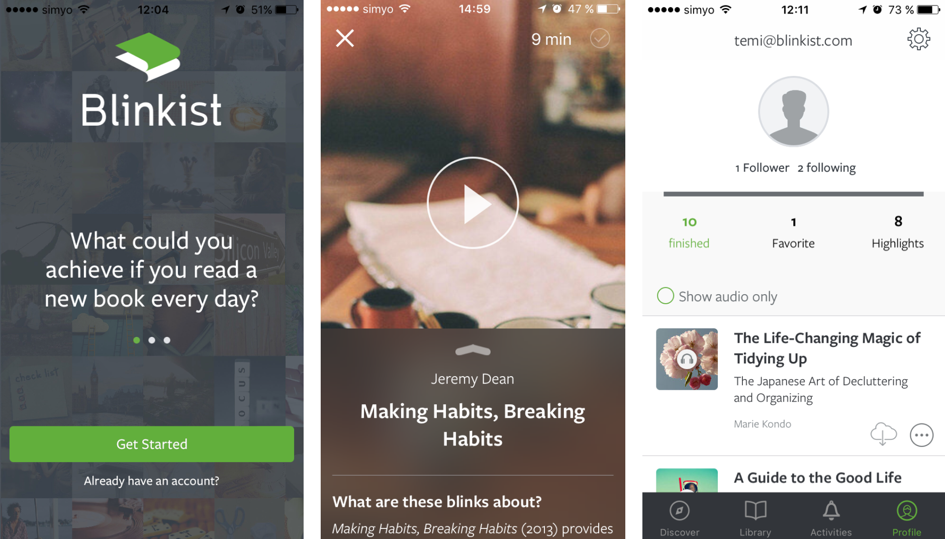
Approach
1. Establishing strategic foundations
The project began with an external agency partner who defined the strategic brand — positioning, audience research, and brand personality. The visual brand was built entirely in-house. That meant quickly establishing a working process against a deadline already in motion — but it gave us direct control over how the identity would translate into product.
2. Developing art direction
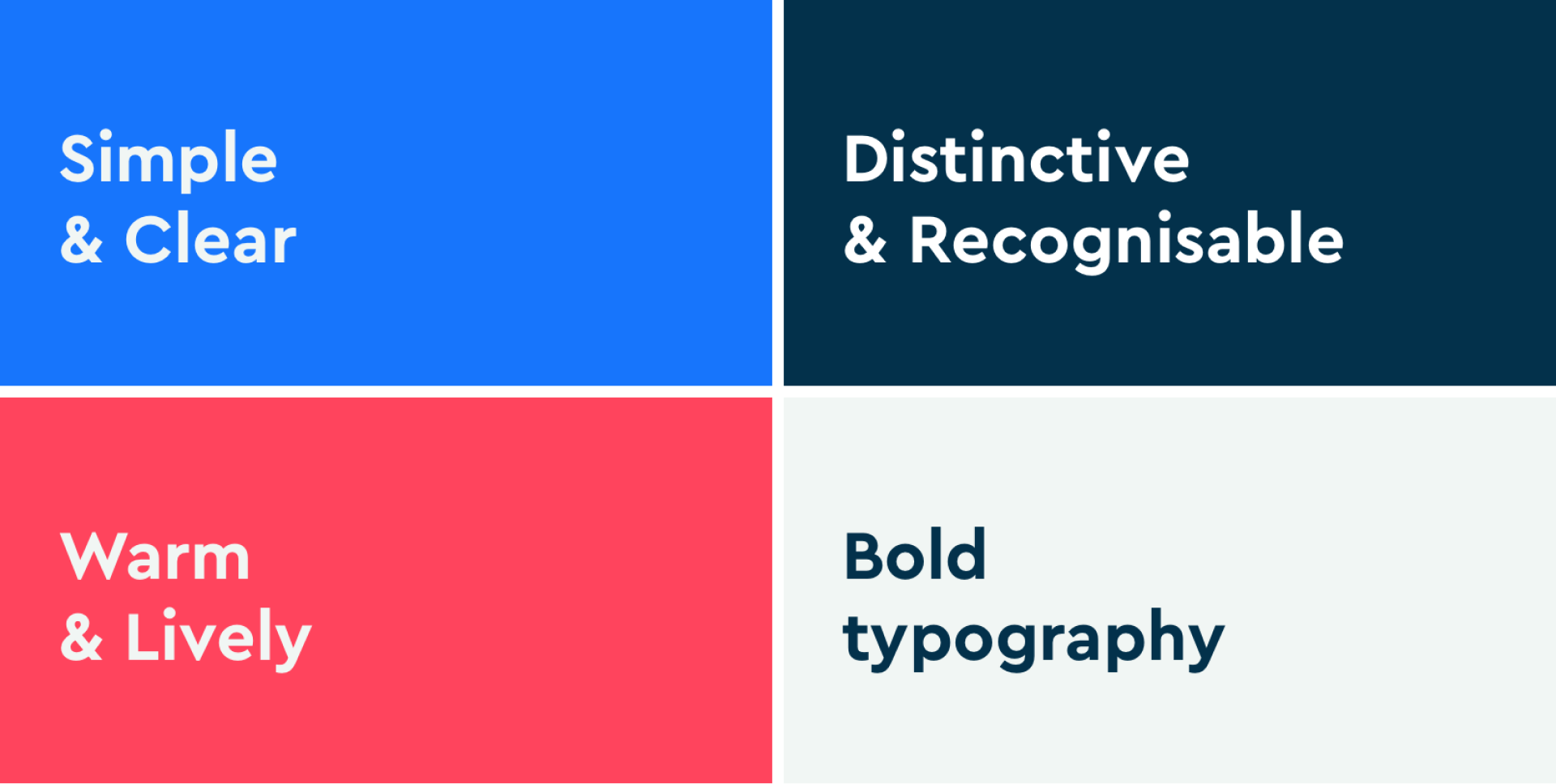
I led the art direction development, kicking off with a workshop to unpack our vision for the visual brand. The goal was to establish principles that would:
- Reflect the new Blinkist
- Create a cohesive visual language
- Scale across all touchpoints
These principles became essential working tools. We referenced them actively in design reviews and used them to maintain consistency as we applied the brand across the company. They gave us a shared language for evaluating work and making decisions.
I explored multiple visual directions, iterating with the team and leadership to land on an approach that felt right.
3. Creating the visual identity
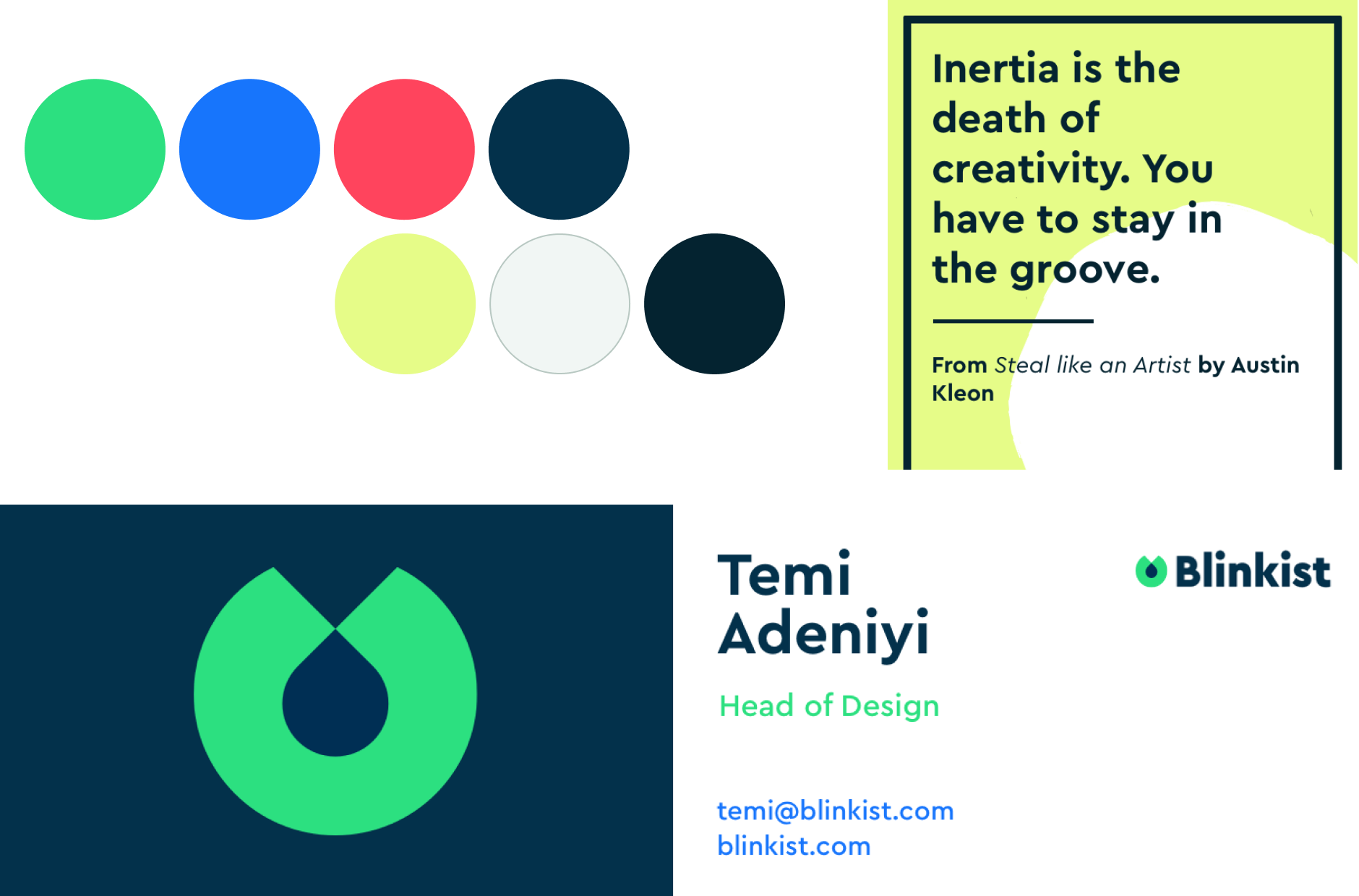
I developed the art direction in parallel with in-house designer Natalia Piana, who led the work on our visual identity. We collaborated closely in our small team — exploring typography, testing directions, and letting each process inform the other.
Once she’d developed the logo and locked in the typography, it helped establish the palette, which in turn allowed me to finalise the art direction. This collaborative approach was a strength that helped us land on a visual identity and art direction that felt truly like Blinkist.
4. Beyond the brand
Applying the rebrand was an opportunity I didn’t want to waste. I advocated for meaningful functional changes alongside the visual updates — the app’s information architecture had barely changed since 2015, despite audio becoming a core feature and the product growing significantly in scope. The experience was showing the strain.
I ran a card sorting study end-to-end — recruiting participants, conducting interviews, synthesising results, and producing a research report — to surface meaningful improvements to the IA. This informed a broader overhaul of navigation, interactions, and core functionality that shipped alongside the new visual identity.
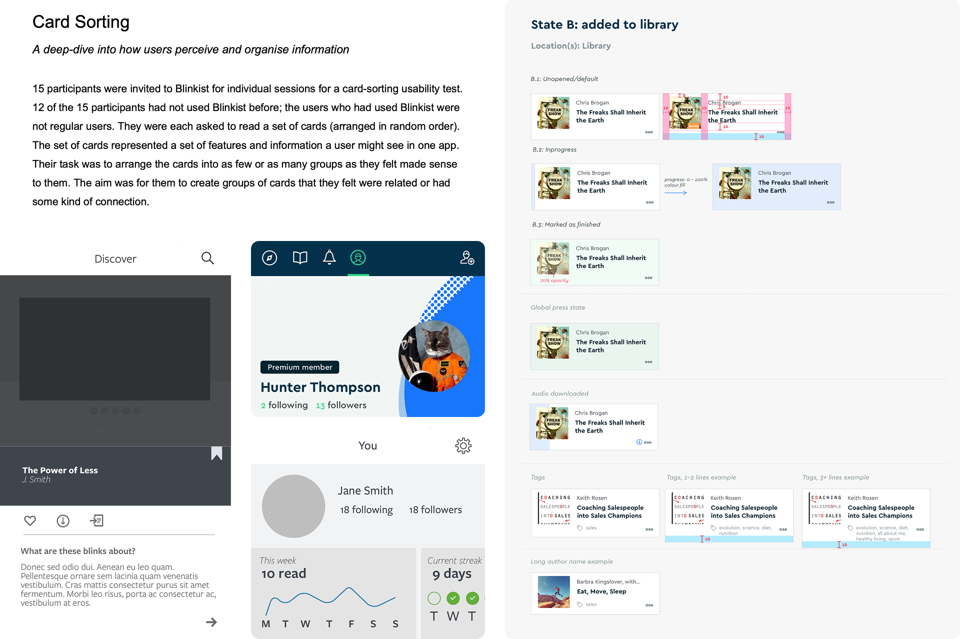
Not everything made the cut. Some improvements identified during testing had to be deferred due to the rebrand timeline. But the structural changes we did ship established a more scalable foundation — one that supported Blinkist’s continued growth in the years that followed.
Outcomes
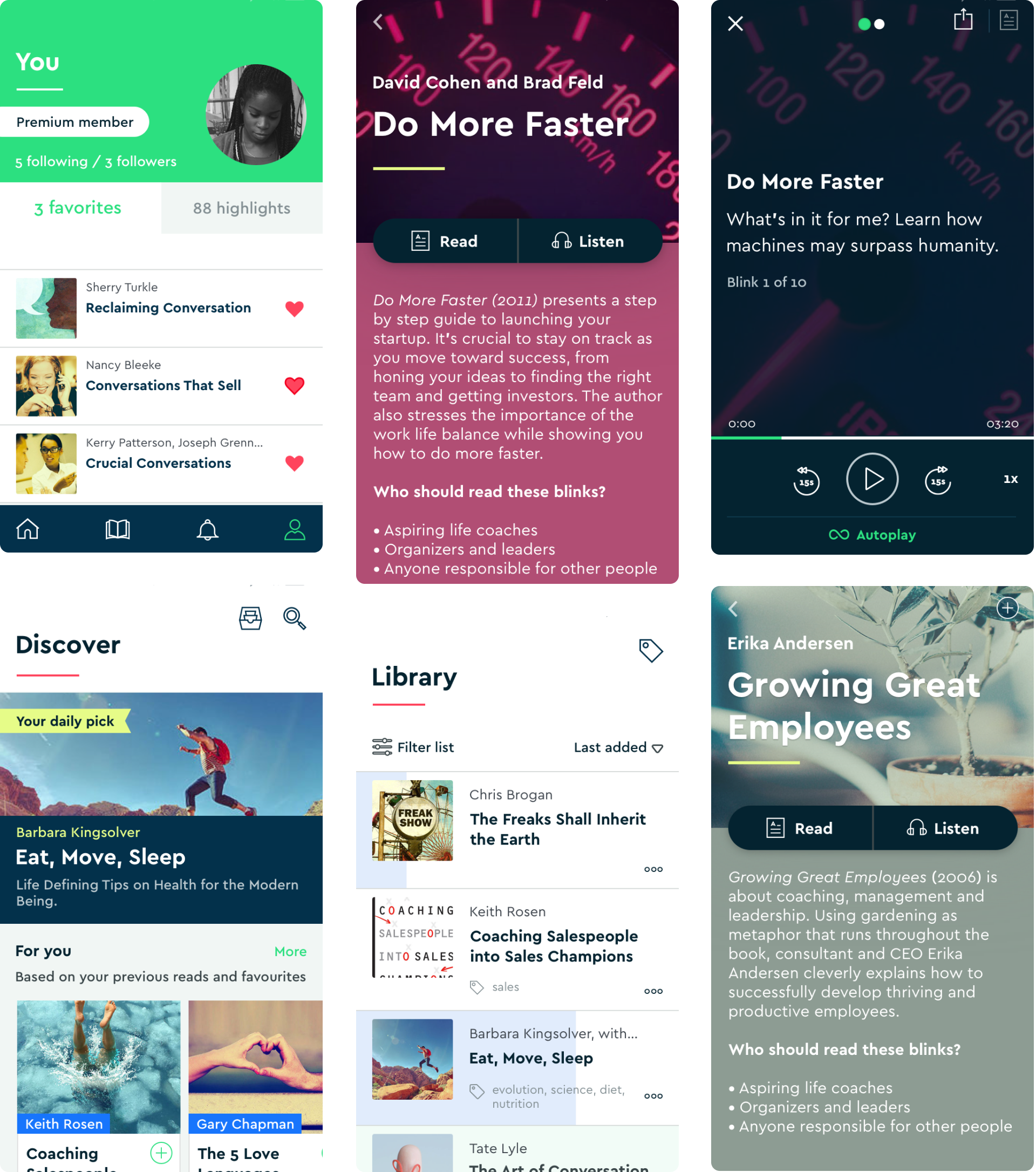
We applied the new brand across every surface from product to social media, marketing and physical collateral. This rebrand wasn’t just a visual refresh — it signalled Blinkist’s maturation as a company and product.
- Industry recognition: Achieved Google Material Design Award for Brand Expressiveness (2017) and multiple Apple App of the Day selections
- Lasting impact: Brand foundations from 2016 guided subsequent visual evolution for years — a sign the system was built to last